


8 Things to Include In Brand Guidelines
Once you have all the essential elements of your brand (logo suite, typography suite, colour palette) it’s now time to compile these elements into a document that is basically your brand bible. A brand guideline (also referred to as a brand book) is a physical or digital booklet that you can refer to when implementing your brand from items such as posters to business cards to physical ads. It can also be used as a guide for external companies that you’ve trusted to implement your brand for you. While brand guidelines can get very extensive and detailed, we’ve compiled a few key components that every brand guideline should have.
1.
Logo Suite (Primary, Secondary, Sub-mark)
Listing all the available logo options is important so that you know when to use which logo and also what is available for use. For example, if you’re working with a smaller space, it’s much better to be working with a pared-down version of your logo like the sub-mark, versus if you’re working with a larger space and can include your more detailed primary logo.
2.
Logo Space & Sizing
Space and sizing of your logo are important because it lists the minimum size that you will allow your logo to be sized, and also the space that you would like to leave around your logo. Make sure your logo has enough space to breathe because that is a part of best practices and ensuring that your brand looks professional and intentional.
3.
Logo Usage
While this one may seem obvious, it’s important to reiterate the ways in which NOT to use your carefully crafted logo. Having your logo mistreated, for example, adding drop shadows, stretching, outlining, etc. may decrease brand consistency and professionalism.
4.
Logo Colour Variations
Many times, your logo colour may not be appropriate for whatever background it is being placed on. In this case, it is important to use your colour palette to provide several different colour combinations of your logo for potential brand applications.
5.
Colour Pallete
Colour palette is hugely important in maintaining brand recognition and consistency. Listing your 4-5 colours and even perhaps the percentage that they should be used in correlation to each other is ideal for this section. TIP: we would suggest listing your colours in the below formats: HEX Code, RGB, and CMYK.
6.
Typography
In this section, we would include all the different fonts and their variations that you would use specific to your brand. For example, you may use Helvetica for your headings and Helvetica Italic for your subheadings, and thus you would include both of them in this section.
7.
Typography Usage
Typography usage lists the treatment of the fonts. Here you would list which fonts you use as a heading, subheading, and paragraph text. You should also list the ways in which you use the text such as specific letter-spacing, strictly uppercase or lowercase, etc.
8.
Potential Executions
Potential executions is a section that simply shows examples of the way in which you would apply your brand. For example, it could show your brand stationery or website or even advertisements. This section is a great example for external companies that are applying your brand for you because it shows the way in which the brand is already being used.
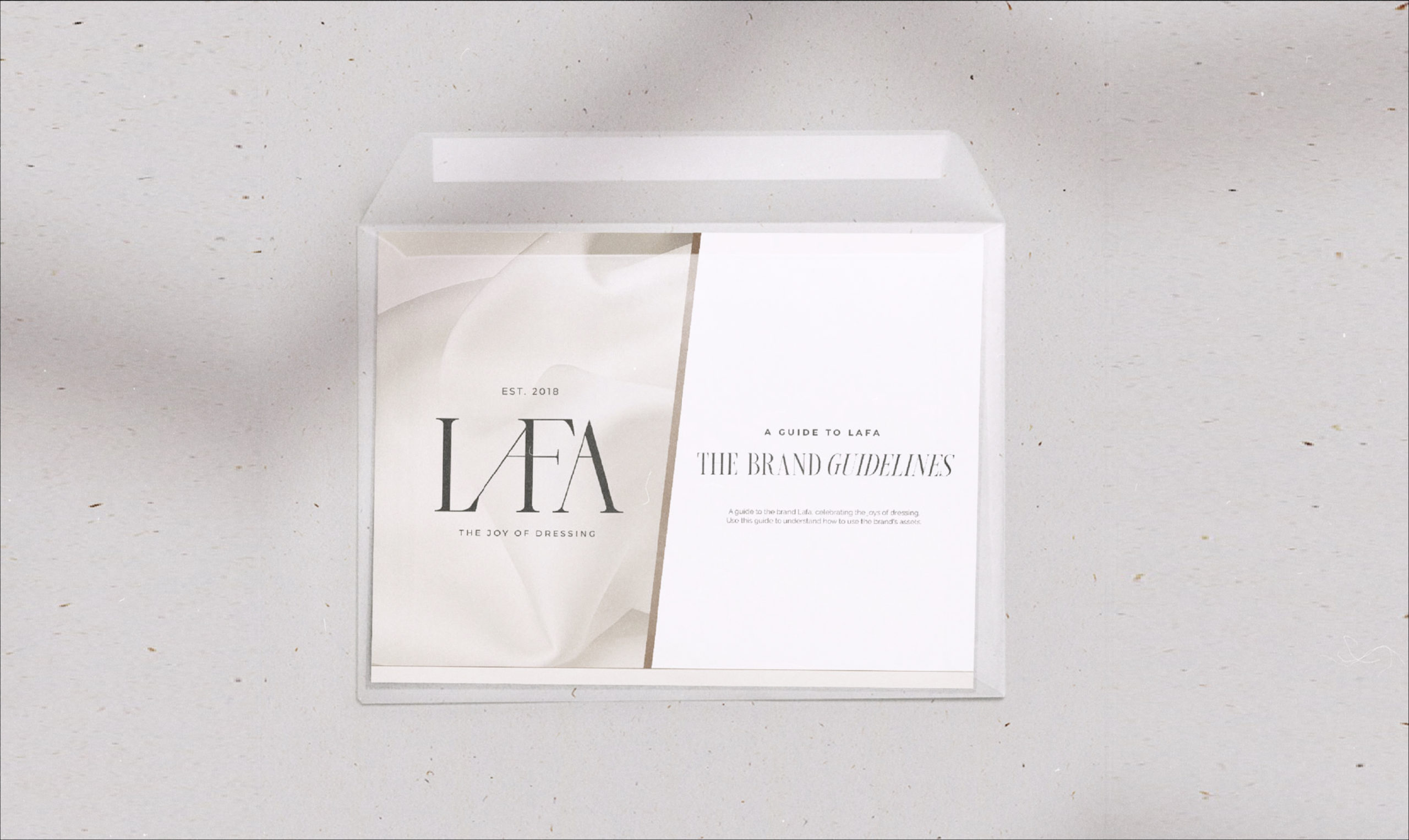
In addition to these items, you could even include photography direction, social feed direction, additional graphic elements, copywriting, tone, and the list goes on. In our experience, brand guidelines usually get more detailed as the business gets larger. Have a look at one of Orijin Studio’s very own brand guidelines.
8 Things to Include In Brand Guidelines
Once you have all the essential elements of your brand (logo suite, typography suite, colour palette) it’s now time to compile these elements into a document that is basically your brand bible. A brand guideline (also referred to as a brand book) is a physical or digital booklet that you can refer to when implementing your brand from items such as posters to business cards to physical ads. It can also be used as a guide for external companies that you’ve trusted to implement your brand for you. While brand guidelines can get very extensive and detailed, we’ve compiled a few key components that every brand guideline should have.
1.
Logo Suite (Primary, Secondary, Sub-mark)
Listing all the available logo options is important so that you know when to use which logo and also what is available for use. For example, if you’re working with a smaller space, it’s much better to be working with a pared-down version of your logo like the sub-mark, versus if you’re working with a larger space and can include your more detailed primary logo.
2.
Logo Space & Sizing
Space and sizing of your logo are important because it lists the minimum size that you will allow your logo to be sized, and also the space that you would like to leave around your logo. Make sure your logo has enough space to breathe because that is a part of best practices and ensuring that your brand looks professional and intentional.
3.
Logo Usage
While this one may seem obvious, it’s important to reiterate the ways in which NOT to use your carefully crafted logo. Having your logo mistreated, for example, adding drop shadows, stretching, outlining, etc. may decrease brand consistency and professionalism.
4.
Logo Colour Variations
Many times, your logo colour may not be appropriate for whatever background it is being placed on. In this case, it is important to use your colour palette to provide several different colour combinations of your logo for potential brand applications.
5.
Colour Pallete
Colour palette is hugely important in maintaining brand recognition and consistency. Listing your 4-5 colours and even perhaps the percentage that they should be used in correlation to each other is ideal for this section. TIP: we would suggest listing your colours in the below formats: HEX Code, RGB, and CMYK.
6.
Typography
In this section, we would include all the different fonts and their variations that you would use specific to your brand. For example, you may use Helvetica for your headings and Helvetica Italic for your subheadings, and thus you would include both of them in this section.
7.
Typography Usage
Typography usage lists the treatment of the fonts. Here you would list which fonts you use as a heading, subheading, and paragraph text. You should also list the ways in which you use the text such as specific letter-spacing, strictly uppercase or lowercase, etc.
8.
Potential Executions
Potential executions is a section that simply shows examples of the way in which you would apply your brand. For example, it could show your brand stationery or website or even advertisements. This section is a great example for external companies that are applying your brand for you because it shows the way in which the brand is already being used.
In addition to these items, you could even include photography direction, social feed direction, additional graphic elements, copywriting, tone, and the list goes on. In our experience, brand guidelines usually get more detailed as the business gets larger. Have a look at one of Orijin Studio’s very own brand guidelines.
June 14, 2022
subscribe
Get our discounts + newsletters. Subscribe below to get on the list.
")
